
Q1.To be able to relate the balance sheet data to the date table, you need to obtain the last day of each month on the balance sheet data side.
Which calculation type and which formula should you use?
Select the best option for each in the answer area.
Show answer
To create a relationship with the date table, you need a date column that holds a value for each row.
Because a measure is an aggregated result, it cannot be used as a key for the relationship.
Also, because you need to obtain the last day of the month, a formula that returns the end of the quarter does not fit the requirement.
By generating the first day of the month from the year and month with an M custom column and using Date.EndOfMonth to return the last day of that month, you can correctly relate it to the date column of the date table.
Therefore, the calculation type is M custom column and the formula is Date.EndOfMonth.
Date.EndOfMonth
Understanding Power Query M functions
Understanding measures
Q2.You have a query open in the Power Query Editor.
You need to understand, as quickly as possible, the percentage of empty values in each column.
Which data preview option should you select?
Show answer
Column quality is a data analysis feature of the Power Query Editor that visually displays the state of each column’s data as the percentage of valid, error, and empty values.
Because it lets you immediately check the percentage of empty values, D is correct.
Since there is no feature called “Show whitespace,” Option A is incorrect.
Column profile and Column distribution do exist, but they show detailed statistics or the distribution of values for a single column, and they are not optimal for this requirement of quickly getting an overview of the empty-value percentage across all columns, so Options B and C are incorrect.
Column quality
Using the data profiling tools
Q3.You operate a Microsoft Power BI dashboard.
You need to allow a viewer (consumer) of a dashboard to leave feedback in a form that is also visible to other viewers who look at the same dashboard.
Which feature should you use?
Show answer
To leave feedback on a Power BI dashboard in a form that is also visible to other viewers, you use the Comments feature.
Comments can be added directly to a dashboard or report, and you can also send a notification to a specific user with an @mention, so C is correct.
Because a subscription is a feature that periodically emails a snapshot of a report or dashboard, B is incorrect.
A favorite is a feature for your own quick access and is not shared with others, so D is incorrect.
A standalone “Feedback” feature does not apply to this purpose, so A is also incorrect.
Add a comment to a dashboard or report
Email subscriptions for reports and dashboards in the Power BI service
Q4.There are two tables in a Power BI model, Customers and Invoice.
◆The Customers table has the following fields.
Customer ID
Customer City
Customer State
Customer Name
Customer Address 1
Customer Address 2
Customer Postal Code
◆The Invoice table has the following fields.
Order ID
Invoice ID
Invoice Date
Customer ID
Total Amount
Total Item Count
The Customers table is related to the Invoice table through the Customer ID column, and one customer may have multiple invoices during a single month.
This Power BI model must be able to provide the following information.
– The number of customers billed in each state last month
– The average invoice amount per customer for each postal code
You need to define the relationship from the Customers table to the Invoice table, and you are required to optimize query performance.
What should you configure?
Select the appropriate option for each in the answer area.
Show answer
Cardinality represents the multiplicity of the relationship.
Because multiple invoices are associated with one customer, the answer to the first item is “1:N (one-to-many).”
The cross-filter direction determines the direction in which the filter propagates.
For this requirement, both “the number of customers billed in each state” and “the average invoice amount per postal code” filter by items on the Customers side, so “Single” is sufficient.
Bidirectional filtering should be limited to cases where it is necessary for performance, so the answer to the second item is “Single.”
Cardinality
Cross-filter direction
Q5.You have the Power BI model shown in the following image.
The Department table has four departments registered.
You need to ensure that each user can view only the data for their own department.
What should you do?
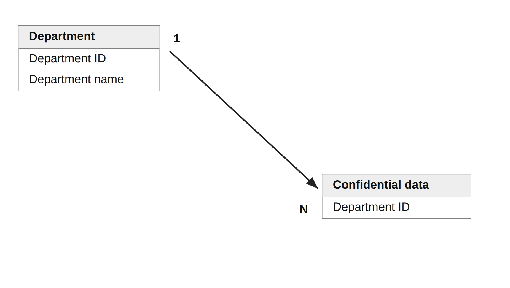
Show answer
To ensure that users can view only the data for their own department, you use row-level security (RLS).
By creating an RLS role for each department and assigning members to each role, you can restrict the rows that each user can view, so B is correct.
CURRENTGROUP is a function for group aggregation and cannot be used for security control, so A is incorrect.
Slicers and parameters can be switched by user interaction, so data from other departments would still be visible and would not serve as a restriction, so C and D are incorrect.
Row-level security (RLS) in Power BI
Q6.You have a set of reports used by the company’s HR department.
You need to create a visualization for the HR department that displays the historical employee count while forecasting the trend for the next 6 months.
Which type of visualization should you use?
Show answer
For the requirement of showing the historical employee count in a time series and forecasting the trend for the next 6 months, a line chart is optimal.
A line chart is suited to displaying the trend of values over time and forecasts, so C is correct.
A scatter chart is for viewing the correlation between two variables and is not suited to a time series, so A is incorrect; a ribbon chart is for displaying changes in rank, so B is incorrect; and key influencers is for factor analysis, so D is incorrect.
Create a line chart in Power BI
Q7.You imported a data-heavy dataset into the Power Query Editor.
You need to determine whether a column contains only unique values.
Which data preview options can you use?
Select two that each present a complete solution.
Show answer
To check whether a column contains only unique values, Column distribution lets you check the count of distinct and unique values, so B is correct.
In addition, Column profile also lets you check the unique and distinct statistics, so E is also correct.
This question asks for two options that each present a complete solution.
Monospaced is a font display setting, “Show whitespace” is a nonexistent feature, and Column quality shows the percentage of valid, error, and empty values and cannot be used to determine uniqueness, so Options A, C, and D are incorrect.
Column distribution
Column profile
Q8.A table has conditional formatting that indicates whether the number of returns is above, near, or below the monthly quota.
You need to ensure that report users with color vision differences can also correctly read the information in this table.
What should you do?
Show answer
To accommodate users with color vision differences, it is recommended to convey information using shapes and patterns in addition to color, not color alone.
If you change the conditional formatting icons to a different shape for each color, users who have difficulty distinguishing colors can still tell the states apart, so D is correct.
Simply replacing them with red, yellow, and green background colors still leaves a dependence on color, so A is incorrect, and adding alternative text that lists the values or moving the icons to a tooltip does not improve the visibility of the table body itself, so B and C are incorrect.
Design accessible Power BI reports
Q9.You plan to embed multiple visualizations on a public website.
The Power BI infrastructure includes visualizations configured as shown in the following table.
Which visualizations can be embedded on the website?
Select two that each present a complete solution.
| Visualization name | Description |
|---|---|
| Visual 1 | Uses row-level security (RLS) |
| Visual2 | Uses a dataset stored in Microsoft OneDrive for Business |
| Visual3 | Is included in a report shared with your user account |
| Visual4 | Is a custom visual |
| Visual5 | Uses a dataset from an on-premises Microsoft SQL Server Analysis Services (SSAS) database |
Show answer
A visualization that uses row-level security (RLS) requires authentication and therefore cannot be embedded on a public website, so A is incorrect.
A dataset on OneDrive for Business can be embedded as long as there is no restriction on anonymous access, so B is correct.
A report shared with a specific user can only be viewed by the recipient, so C is incorrect; a custom visual can also be embedded as long as there is no restriction on the data source, so D is correct; and on-premises SSAS requires DirectQuery authentication, so E is incorrect.
Publish to web from Power BI
Considerations and limitations
Q10.You have a report that contains a bar chart and a column chart.
The bar chart shows the number of customers per customer segment, and the column chart shows the sales by month.
When you select a segment in the bar chart, you need to be able to see how much of the total sales for that month belongs to the selected customer segment.
How should you set the visual interaction of the column chart when the bar chart is selected?
Show answer
When you select a segment in the bar chart, you want to show the proportion that segment represents within the overall monthly sales, so you set the visual interaction to “Highlight”.
Highlight keeps the whole in place while emphasizing only the relevant portion, so you can grasp the composition ratio of the part to the whole, so B is correct.
With “Filter,” everything other than the selected segment is hidden, so you cannot compare with the whole, so C is incorrect, and with “No effect,” no interaction occurs and the requirement cannot be met, so A is also incorrect.
Change how visuals interact in a Power BI report